


Baseline #3 – Base Components
Baseline #3 – Base Components
...and why I’m relying on them less often.

Hello again! 👋 It's tough to believe that the first month of 2022 is almost nearly over and that this is now the third edition of this little newsletter. I'm having so much fun writing again and sharing more with all of you, and I genuinely hope some of the ideas and thoughts I've written about so far have been valuable. I want to say thank you to everyone who's subscribed and for all of the encouragement as I continue to shape and form this new medium for myself.
Figma Focus: Base Components

Earlier this month, I shared a change that I recently made when it comes to working and creating components for others to use within Figma. The change? I'm no longer relying so heavily on base components to create published components.


If you're unfamiliar with this idea, don't worry! The concept is that base components can help define and enable the structure for an actual, published component to be used by any designer working within the design system. For example, imagine creating a new button component and accounting for all of its possible states, icon placement options, and sizes. Because you're likely to end up with a few dozen variants in total, the idea of needing to one day adjust the corner radius, font, or any other property for all of those variants can feel daunting and even more tedious. When using a base component that's nested within the many button variants, any adjustment only needs to be made within that one component, propagating to all buttons within the design system. Here's what that would look like in Figma's layer panel:
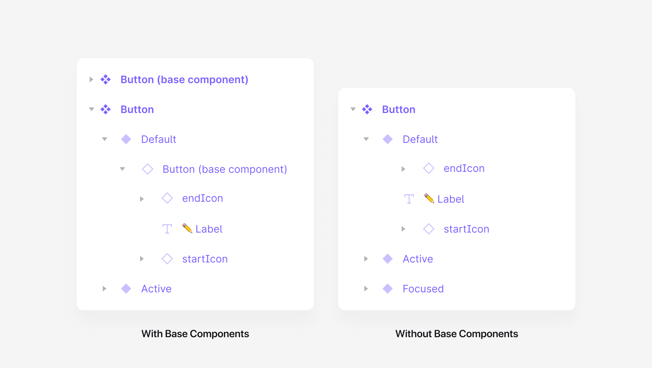
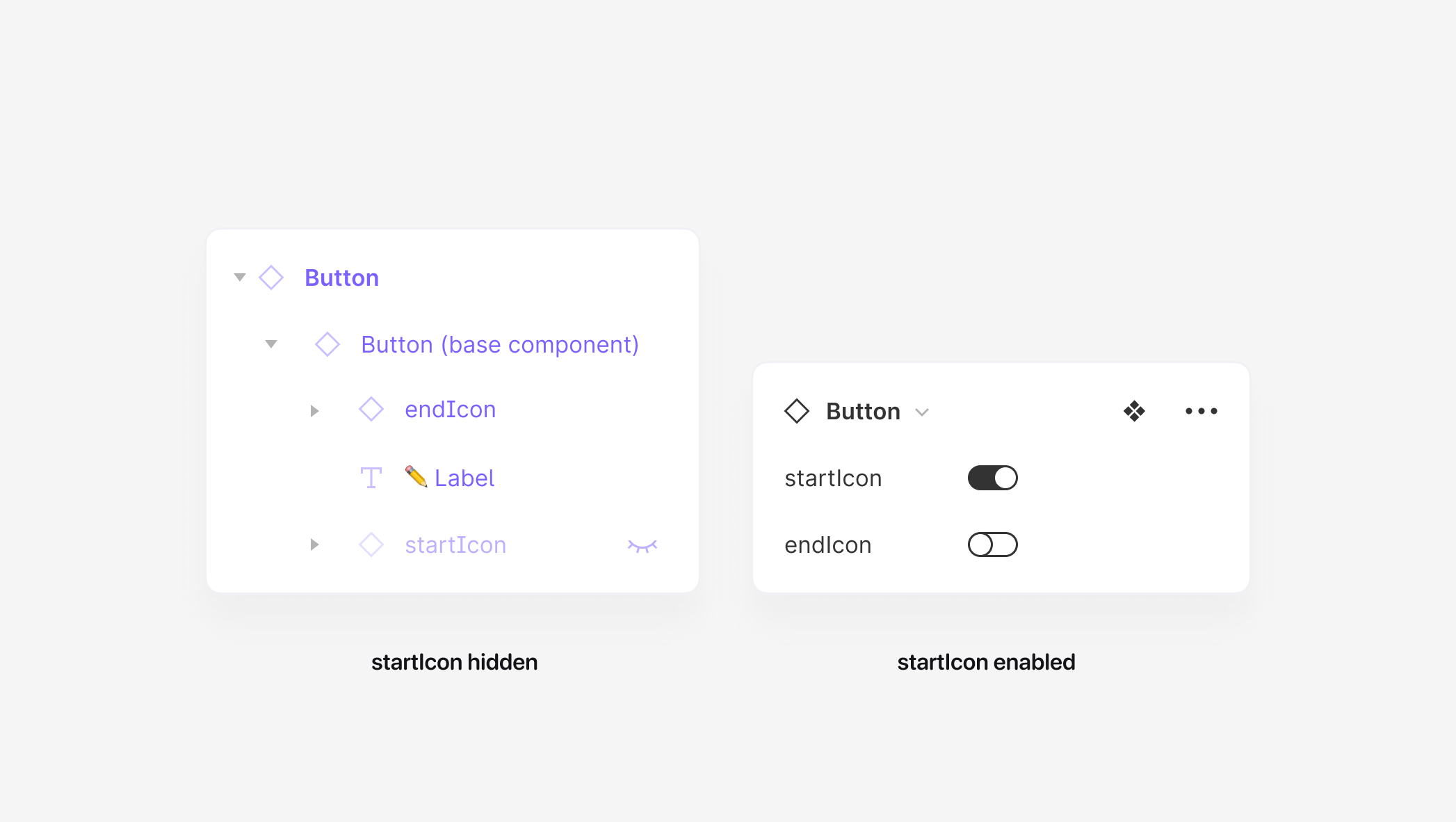
The concept sounds helpful, so why am I no longer using this method as often as I once was? One of the largest limitations of instances in Figma is that it's not possible to add additional layers to them, such as text layers or icon layers. Any additional layers need to be included in the original component, and when working with base components, those layers must be hidden for the component to match its appropriate variant correctly. In the button example above, let's say we create a variant property called startIcon, and it has two options: true or false. If the property is set to true, the startIcon layer would need to be made visible, and if it's changed to false, the startIcon layer would then need to be hidden. What can become quickly complicated is if one of those layers is manually hidden through the Layers Panel, which means what's on the canvas is out-of-sync with the component's selected variant options. This mismatch may confuse designers using the component or developers who rely on Figma's Inspect Panel, where each variant option is displayed.
Additionally, just like with our button in the example above, for any component, all states must be created through hidden layers within the base component, and this can be pretty tough to both create and manage, especially for ones that are much more complex. In my own experience, this creates tons of upfront complexity and a packed layer panel, possibly containing dozens and dozens of hidden layers. The component could become confusing for any designer using it, as layers can be made visible and more opportunities for mismatches are possible.

Jan Toman had a great reply to my original tweet, which in so few words encapsulates the exact thing that's been on my mind: "usability over maintainability." I always want to save myself a bit of time in the future and I’ve been doing that through relying on base components, but the reality is I believe they often create a worse experience for the designers using them. I was always trying to prepare for the day when the corners of buttons would become more rounded or where the typography would change, but in reality, that so rarely happens, and it led me to question if the time spent creating and maintaining base components was worth the time of just making the adjustments, if or when those visual or structural changes did come.
So, I’m curious. If you or your team currently rely on base components, how are they working? If any of the above resonates with you, what techniques have you found that work best to make them easier for everyone to use?
In case you missed it...
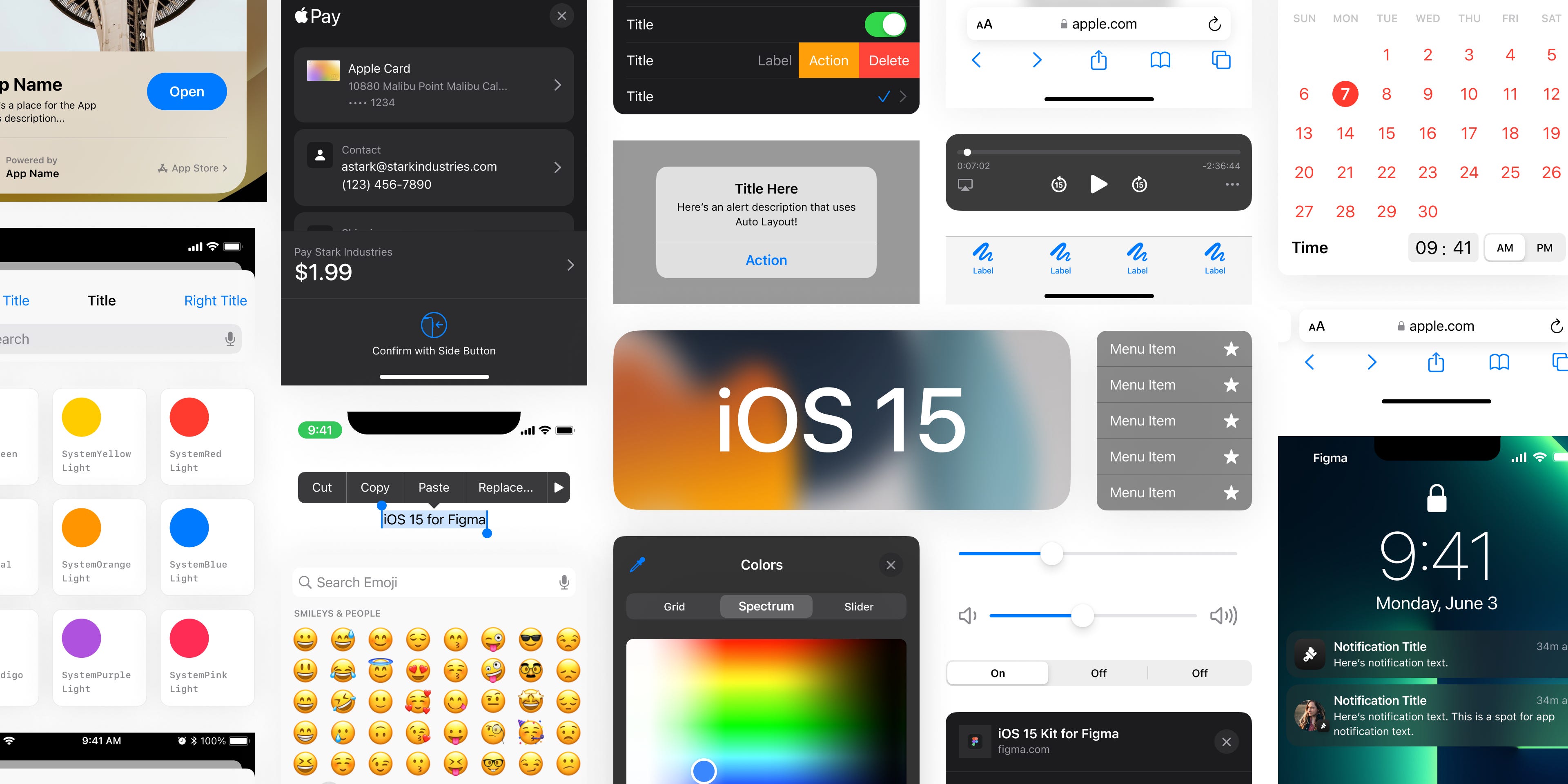
Last week, I published another update to my iOS 15 UI Kit for Figma, which includes better support for the sizes of Apple's iPhone 13 & iPhone 13 Pro and includes a new editable icon layer inside the Tab Bar. (If you've ever used any components from this kit for work of your own, I'd love to know!) I'm so appreciative of all of the support from the design community for this project, and I'm already looking forward to iOS 16's arrival at WWDC this summer.
Recent bookmarks
For the past few months, I've been using Automator.design by Jordan Singer within my Figma files to help me automate many of those small (and large!), repetitive, and tedious tasks. It's a delight to use, and I'm so encouraged and inspired by the clever ideas others are coming up with for automations.
Last week, the team at Framer revealed their latest product, Framer Sites, and I'm so excited to try this out soon!
Back with another wallpaper recommendation, and this time, it's from YouTuber Christopher Lawley. This wallpaper pack includes 27 gorgeous high-resolution landscape photos, with sizes already created for iPhone, iPad, and the Mac. 🏔
Say hello!
I always love hearing from people, and if you enjoyed this, please reach out! You can find me on Twitter @joeyabanks.
Hi Joey, I noticed your first tweet about it and thankful for the deep dive in your reasoning 🙏
You are saying how base components undermine usability, but in my team we have a rule “if you have to go to Layers Panel to adjust the component, you’re doing something wrong”, that’s because the API of the component in Figma (true/false or drop downs in Variants panel) is synced with the API in code. If a designer cannot achieve a desired variant through the provided API (Variants panel), this means that this new variant will require a change in code. This rule of ours also solves the “out-of-sync” problem you mention.
Although I've only tuned in a couple of months ago, I'm really enjoying reading and re-reading these articles! It's awesome value, easily digestible and immediately actionable. Fix part of my reading moment in my morning ritual. Just wanted to share my appreciation: thanks man!